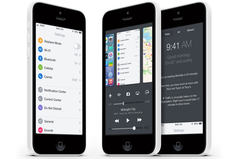
A concept video of what a unified Control Center and multitasking interface would look like in iOS 8 has been created by designer Bill Labus and posted by TheTechBlock (via Cult of Mac).
The version of iOS 8 in the video shows the app switcher and user settings in one unified view accessed by a single swipe up gesture. Users are free to multitask or toggle preferences such as music volume and WiFi, as the buttons for the toggles themselves have been combined into one space to allow for more room. The video also shows a refined Notification Center that features a minimalistic look with more centered text, which is triggered by a swipe gesture down.

Labus also noted his reasons for making such changes to integrate the multitasking switcher into Control Center:
Unfortunately, I find double-clicking the home button to be irritating- there’s a noticeable delay between the second click and the multitasking view appearing, and in my haste I often accidentally triple-click the home button, forcing me to wait while the OS bounces into, and back out of, multitasking. Control Center’s bottom edge gesture is far faster and easier to perform, however as I said I do use Control Center frequently as well, so I wouldn’t necessarily want to swap the two and use the home button double click to bring up Control Center.
Apple introduced Control Center and a refined version of multitasking with the release of iOS 7 last fall. While an overhaul or unification of both is unlikely to happen with any immediate update to iOS 7, it is possible that Apple could make major changes in time for iOS 8, which will likely be released this fall.


